
When subjected to the CPI, the Case-Shiller tells a different narrative of home values.
Standard & Poor’s released the latest Case-Shiller Indices last Tuesday, reporting a 1.1 percent drop from November to December and a 4 percent drop from December 2010.
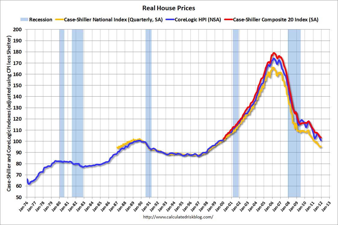
Those indices, however, rely on nominal prices, not the “real” prices that consider inflation, and as Bill McBride of Calculated Risk has it computed, the real data on the indices tell a much more dramatic story on home values.
Real prices are determined by using the Consumer Price Index, or CPI, which measures inflation by tracking the prices of a number of goods and services when compared to a base year. In the case of housing, McBride used the 1999/2000 price levels as the base.
The two graphs, which chart the quarterly Case-Shiller, the 20-city composite Case-Shiller, and the CoreLogic home index, are roughly similar in shape, in that they feature huge increases from January 1997 to January 2006, followed by steep declines to the present day. However, the specific details of the graphs are what matters.
McBride’s graph features a lower peak of the 20-composite index at 180, compared to 203 for the nominal graph, but more important, it features a much steeper decline that brings the graph down to 104, far below the 139 of the nominal graph.
Those differences, according to McBride, have particular significance on the historical front.
“In nominal terms, the Case-Shiller National index (SA) is back to Q3 2002 levels, the Case-Shiller Composite 20 Index (SA) is back to January 2003 levels, and the CoreLogic index is back to February 2003,” McBride writes. “In real terms, the National index is back to Q4 1998 levels, the Composite 20 index is back to March 2000, and the CoreLogic index back to December 1999. In real terms, all appreciation in the ’00s – and more – is gone.”
A big portion of that additional drop has transpired in the last three years. In the nominal graph, prices rebounded in 2008, and the index has grown mostly sideways every since, though it has fallen from mid-2010 to the present. The real graph, though, shows an entirely different, far more telling scenario – prices have continued dropping the last three years, and the index is now at 1998/1999 levels, meaning an entire decade of housing gains has been wiped clean by the downturn when inflation is factored in.
This all may sound like dire stuff, but thankfully, there is a definite light at the end of the tunnel, also supplied by Mr. McBride. Nearly a month ago, McBride wrote that the two housing bottoms, one of price and one of sales, construction and investment, were both upon us, and though 2012 may be a year of sideways growth, 2013 would emerge as a positive year. The one catch involves the Case-Shiller, which operates on a two-month delay, and because of that, will likely be reporting negative pricing data through the spring.