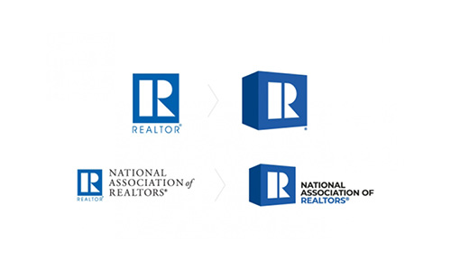
After 45 years, the National Association of Realtors’ familiar logo is on the way out in favor of a refreshed new look that the organization hopes symbolizes its focus on the future. The new logo — featuring a 3-D cube that’s tilted to the right, a new blue color and a new font — is the result of a year of focus testing and research.
“I think we all recognized the fact that a 45-year-old logo that hasn’t changed, hasn’t been modernized, isn’t contemporary was still conveying a perception of the old NAR,” NAR CEO Bob Goldberg said. “What we’re trying to show is that with all the changes I’ve been implementing in the organization, this is an optical way to convey this new dimension of NAR. That’s the reason for the three-dimensional look.”
NAR will begin its official brand transformation in June. About $34 of members’ annual dues to go toward educating the public about the organization. Although the specific cost of the logo is unavailable, a NAR spokesperson told Inman that the design and associated research would likely cost about half of its approved $497,000 budget.

