
What makes a good website? It’s a question anyone with a website should ask themselves. In real estate, your website is your online face – its organization, function and design reflect on you as an agent.
To figure out what works and what doesn’t, we referred to Real Trends 2015 Real Estate Website Rankings. Here’s what we learned from the top websites on the list.
1. Keep it simple, stupid
Last year, the real estate website ranked No. 1 overall was that of Michael Saunders & Company, a brokerage based in Sarasota, Fla.
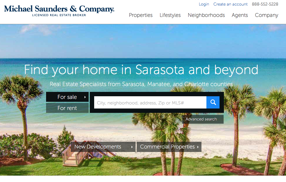
When users land on the page, they are not greeted by a flash display or an indulgent marquee touting how great the company is. The first thing users see is a simple main navigation bar adorned with “Michael Saunders & Company” branding and a text box directing users to begin their home search. The page isn’t loaded with widgets and features; there are no virtual assistants popping up in the corner of the screen. It’s a simple, clean design that intuitively funnels users to the primary purpose of the site – to find a home.
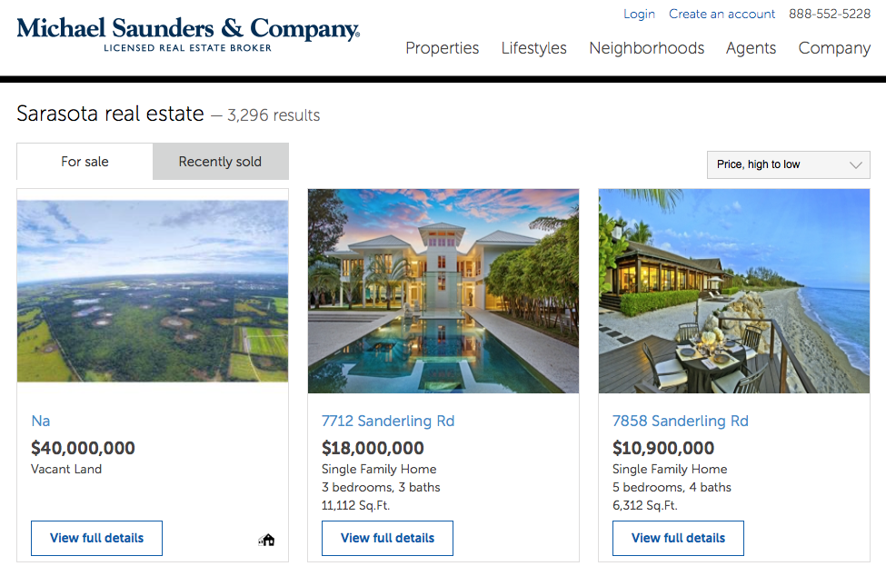
The search results page is laid out much the same as the home page: it is easy to navigate, the necessary information is made readily available, and the design is clean and simple enough to be appealing.
At the end of the day, simplicity and clarity go a long way to enhancing both user experience and design.